MITI

PROBLEM
Talking about money with people close to you is delicate. Whoever organises group expenses lands in a paradox: they want costs split fairly, but they don't want to be seen as the person chasing the money. The friction isn't arithmetic — it's the reminder, the moment you have to ask a friend for money and risk looking like una rata. What the organiser wants isn't a ledger. It's to close a plan knowing everything is resolved, without having asked anyone.
RESEARCH
A survey of 48 people, plus forum threads where people were already describing this unprompted.
Shared expenses are constant: 31% share costs daily and 40% two or three times a week, mostly with friends. Only 19% track them at all.
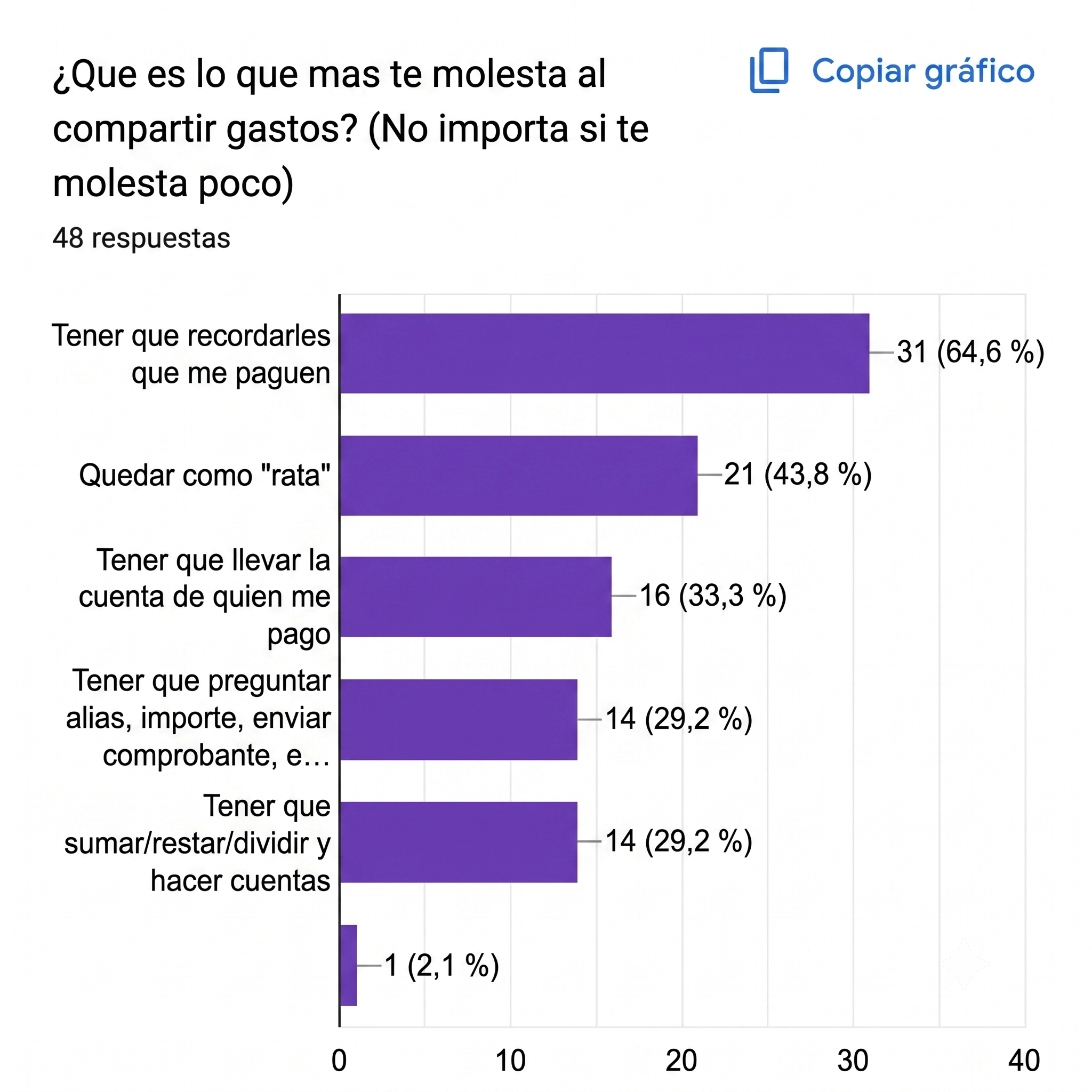
The pain is social, not mathematical. 65% say the worst part is having to remind people and 44% fear looking stingy, against 29% who mind doing the maths.
The hardest finding: half don't track and don't want to. Half the market rejects the behaviour a tracking app requires, which is why the design can't ask everyone to participate equally.
USERPERSONA
Joaquín is organised and responsible, and doesn't normally use apps for this — but he always ends up as the accountant of his group. He needs something that records expenses automatically and sends the reminders for him: he carries the mental load of fearing he'll miss a number, feels uncomfortable claiming payments, and gets frustrated when nobody else keeps control.
What he wants isn't a ledger. It's to close a plan knowing everything is resolved, without having asked anyone.

GAP IN THE MARKET
Four mature competitors: Splitwise, Tricount, Settle Up and Splid. All handle one-off expenses, automatic division and notifications. None handles fixed or recurring expenses, sets of related expenses, or Argentine payment methods — and groups here pay with cash, transfers and Mercado Pago.

PRODUCT MODEL
The central decision is that a shared expense isn't one kind of thing.
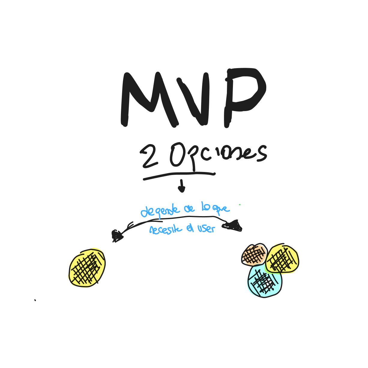
A simple unit is a standalone cost with nothing to compute a balance against — splitting a coffee. A complex unit is a set of expenses that only make sense together, like a trip, where each one feeds a running balance of who owes whom.
Every competitor forces one model. 60% of respondents have only sporadic expenses and 35% have both, so a single model is wrong for a third of them by definition.
The MVP covers five functions — create an expense, split it, mark who paid, view balances, send reminders — and the reminders carry a constraint from the research: in a product built to remove social discomfort, a notification with the wrong tone reintroduces the problem it exists to solve.
INFORMATION ARCHITECTURE
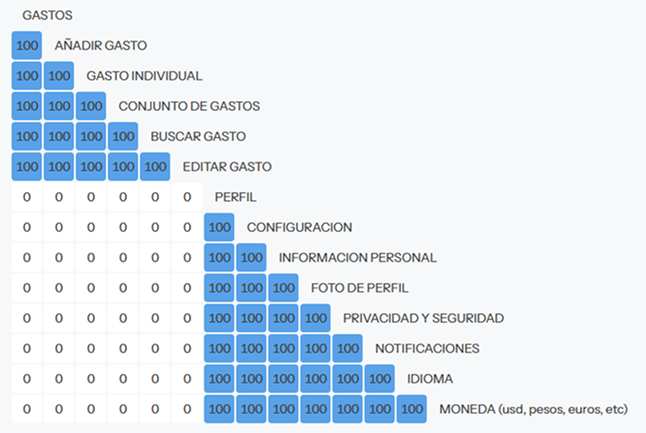
I proposed an architecture, then card-sorted it — and it changed. My hypothesis had three top-level areas: Settings, Home and Account ("Perfil"). Participants filed every profile item under Configuración with full agreement. Nobody treated Account ("Perfil") as a destination, so it isn't one. The final architecture has two areas.
VISUAL DIRECTION
Black and white, with emojis as the visual protagonists. The reasoning comes from the research, not taste: this problem already lives in WhatsApp groups mixing jokes, memes and payments. Emojis are the native language of the conversation the app replaces, so a minimal interface can carry tone without decorating a screen that's fundamentally about money.
REFLECTION
The strongest thing here is the simple/complex model, and I buried it in a sketch near the end while the summary led with five functions any competitor already has.
The MVP also doesn't reach the gap my own benchmarking found. If I revisited it, Mercado Pago would be in the first version — the hardest thing for a foreign competitor to copy, and the one the research says the audience needs.
What I'd keep is the research discipline. The half who don't track and don't want to is a finding that argues against the product, and it shaped the core interaction instead of being quietly ignored.