LA POSADA DEL TANO
PROBLEM
My mom spends a lot of time replying to the same questions on Instagram, one by one — many times a day, and far more during summer and the months leading up to it. There was no clear, attractive, consistent digital presence answering the things everyone asks, so every answer had to be typed by hand. She always replies quickly, so nobody is left waiting. The cost isn't lost customers — it's her time. Hours spent on manual customer support are hours not spent creating content, running ads, or improving the space itself: the things that actually grow the business.
WHO IT'S FOR
People between 25 and 50 who want to celebrate something with their family — birthdays, anniversaries, weddings, Christmas, New Year's. Most of them live close to the quincho, and many have already been guests there. They aren't discovering the venue; they already trust it. That changes the entire design problem. The site doesn't need to convince anyone the place is good. It needs to remove the friction between deciding and booking.
SCOPE & CONSTRAINTS
Before designing anything I answered three questions:
How will I solve this problem? How will this first product work as an MVP? Why am I building it at all?
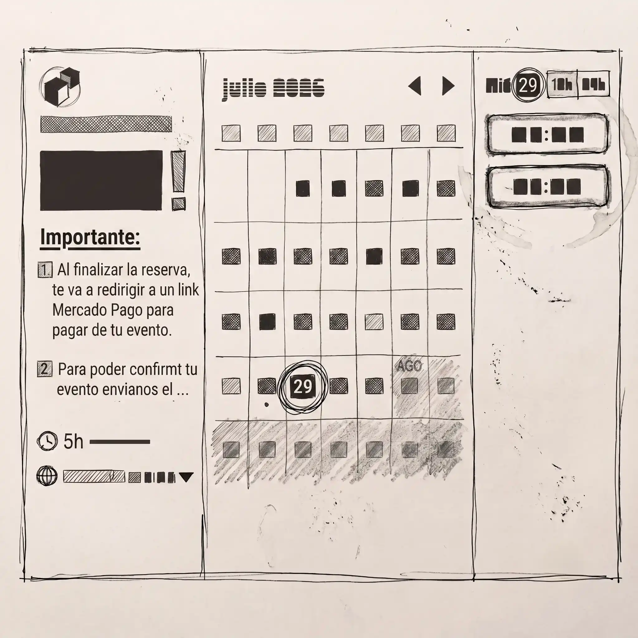
The answer: a website you can visit to find what you're wondering about. The MVP is a real booking system — not a contact form. That distinction is the whole project. A form would relocate the problem, not remove it: mom still opens a message and still types a reply. Instead, visitors see genuine availability through a synced calendar, pick a date and an hour range, leave their contact details, and pay. The booking closes itself. Every question from the problem statement maps to somewhere it gets answered.
Availability goes to the booking system. Prices, capacity, location, schedules, and the extra hour go to frequent questions, mirrored in Instagram highlights so the answer exists in both places people look.
BRAND & STORY
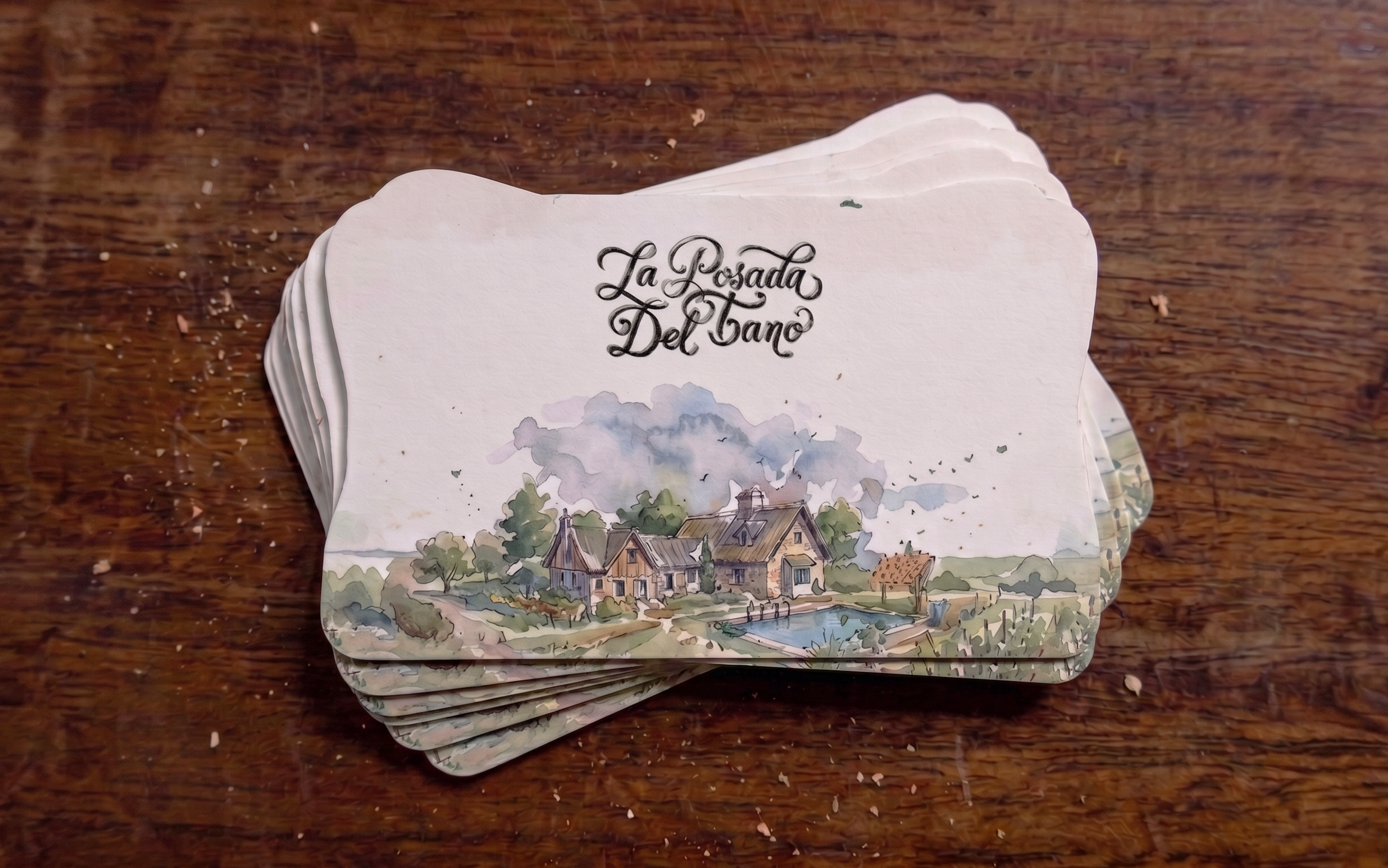
The whole brand comes from one question: how does an adult remember their childhood at the quincho with their family? Those memories aren't sharp or high-definition. They're felt — soft around the edges, diffused, full of colour, because the joy of those moments was real even when the details blurred. The visual language is built entirely on that. This is also why it's a strategic direction and not a stylistic one. Most visitors have already been guests here. A brand made of memory speaks to people who already have a memory of the place. The brand is built entirely on El Tano, and it never says so publicly. The story is the source of the work, not the marketing. What the brand puts forward is the thing people actually lived: childhood, family, celebrating together.
DESIGN DECISIONS
The MVP is the booking system, so the primary CTA had to be unmissable. But I wasn't going to lose the brand to achieve it. That was the real challenge: a site that's beautiful, carries the brand essence, and performs. Three decisions in this project run on the same logic. The brand is made of memory because the audience already has memories here. The copy never explains the family story because they already know it. The site doesn't sell the venue because nobody needs selling. The audience already has the relationship — so the design never explains, it only removes friction.
FINAL SCREENS & BUILD
Hero: An illustrated background and a single CTA: "Elegí tu fecha." No headline, no copy, no information. That works precisely because most customers already know what La Posada del Tano is. In front of the illustration sits the LPDT sign, the real wooden sign standing in the garden, rebuilt as the front layer.
Navbar: A conventional navbar with a clear CTA, which was the right call rather than the boring one. This audience arrives knowing what they want; anything more inventive would have made them work to find it.
Preguntas Frecuentes opens a dropdown that exposes the frequent questions themselves as links. Someone scanning sees their own question already written out, so they never have to click to find out whether the answer exists.
"Nació de familia, ahora invita a la tuya." It only works because of who's reading it. There's no reason to write "el quincho fue hecho para…" for people who were already here.
Espacios — the brand concept executed as an interaction. An infinite gallery of fragments from moments at the quincho. Click one and it moves to the centre, the rest disappear, and the illustration becomes a real photograph. That's the identity behaving rather than decorating.
People. Real photographs of people in the quincho. Everything else on the site is illustrated, so this is where the brand stops being an aesthetic and shows the actual families it's made of.
Reseñas. Reviews pulled from Google, with a CTA out to the full list. Most of this audience doesn't need convincing — but returning customers forward the link to relatives who've never been, and social proof does that work at no cost to the people who already trust the place.
Booking — where the brand steps back. No watercolor in the booking flow. The navbar and the colours stay, so the brand never breaks, but the flow itself is clean and direct. A booking system has to be as clear as possible; making this step beautiful instead of functional would be a red flag, not a win.
REFLECTION
The frequent questions were originally in the footer. They're the reason this site exists — every question from the problem statement lands there — so burying the site's purpose below everything else was wrong. It's fixed: they now live in the navbar as a dropdown that surfaces the questions themselves, not just a route to a section.
Adding an extra hour still isn't bookable. Its price is answerable, but the action stays manual, so one small loop survives from the original problem. That's the first thing I'd build next.
What I'd keep is the restraint. No watercolor in the booking flow, no scroll-storytelling in the hero, no loading animation — three pieces of work I designed and then cut because they cost the user time. The brand carries emotion everywhere except where it would slow someone down.
The clearest thing I learned is about my own process. Understanding the structure behind an effect — sticky frames, absolutely positioned layers, trigger sections — is what lets me direct a build instead of accepting whatever comes back from it. I can't write that code by hand, but I can describe the mechanism precisely enough to get it built and check the result against what I asked for.